Funnels built to make saying yes feel effortless.

At Likeflare, we help you build the kind of funnel your business deserves — simple, powerful, and built to convert. You bring the vision. We bring the battle-tested strategies. Together, we’ll craft a buying journey that feels effortless for your customers and unstoppable for your growth.

Trusted by Fortune-500 brands
Get in touch

Your funnel is likely too long. We fix it.

The traditional marketing approach stops at the ad click. Ours doesn’t. Because that’s when real decision-making happens. Most businesses lose customers between the click and the checkout — with long forms, confusing pages, and too many steps. The best way to qualify a customer is to get them to pay. After years of testing we've narrowed our ideal funnel down to two steps. Everything else can wait until after the sale.

Landing page

Make them want it.

Checkout page

Let them buy it.

The perfect funnel is the simplest path to yes.

We simplified MBA ASAP's funnel to two steps.

Step 1: The landing page
We found that a video on a landing page works really well. We also integrated an AI shop assistant that sounds exactly like Prof. John Cousins and is trained to answer questions on the course and technical matters.
Step 2: The checkout page

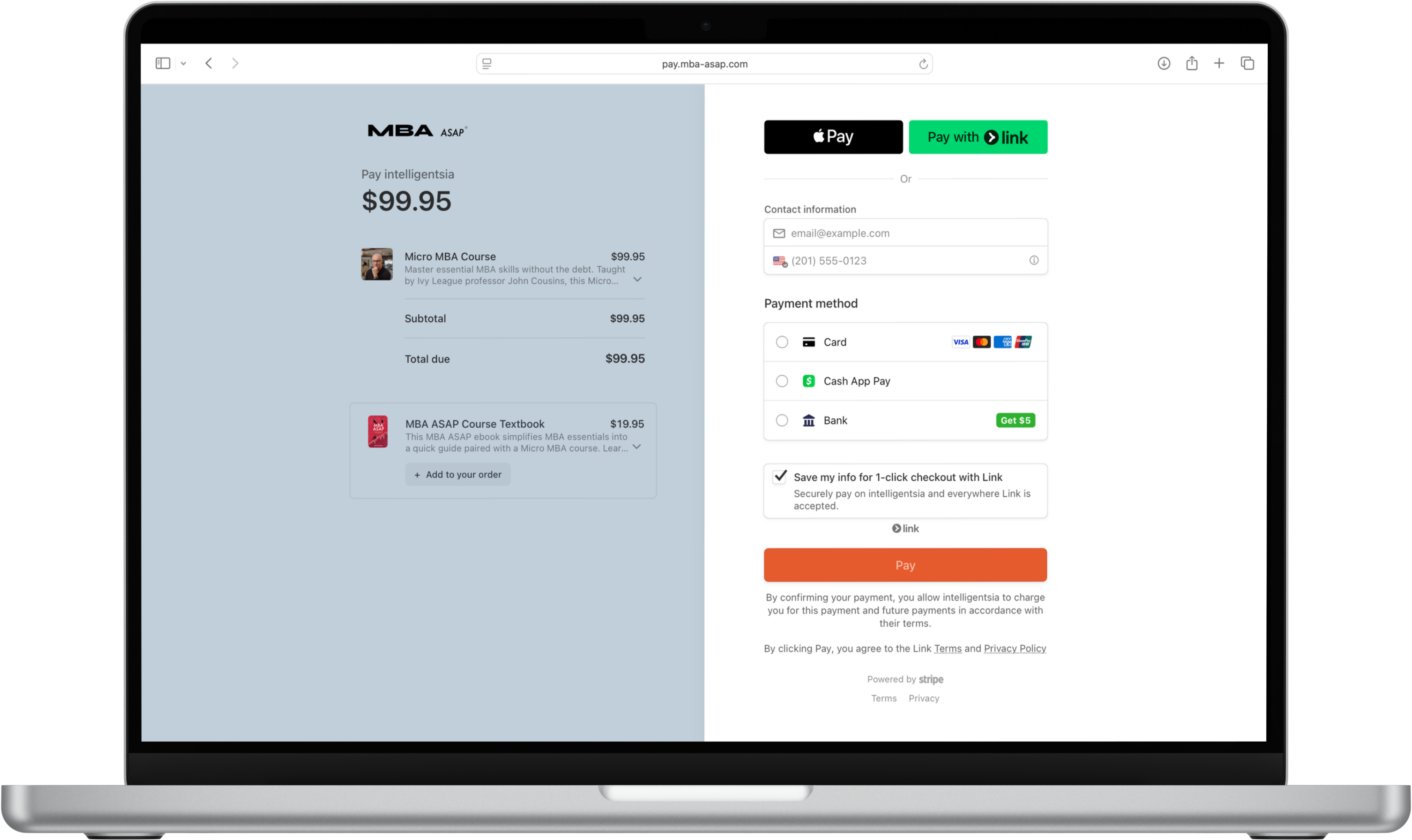
Online courses nearly always have you create an account before the sale is closed. We decided to first close the sale, then set up you account. The result? A buying experience so simple, it felt effortless. More completed purchases. Less abandoned carts. Happier customers.

92%

Faster checkout time

45%

Course sales increase

But sometimes two step funnels are impossible

Eyesurf is a good example of this. They are a Canadian ISP with a complex sales funnel.

Step 1: The landing page
On the new landing page, we built in a simple coverage checker with real-time address suggestions. Instead of typing everything from scratch, customers could find their address in seconds. It removed one more point of friction — turning what used to feel like work into a quick, confident first step toward buying.
Step 2: Pick your plan
After checking coverage, customers landed on a clean, simple “Plan Select” page. No clutter. No confusion. Just clear options, easy comparisons, and a fast path to checkout. Behind the scenes, we also set up Facebook ad tracking to fire at this step — giving Eyesurf real-time insights into which ads were working and where customers were dropping off. It wasn’t just a better experience for the user — it was smarter data for the business.
Step 3: Pick your router
We added a simple “Select Your Router” step — giving customers the option to rent a router or use their own. If they had a router already, they could skip the rental and save money. If they didn’t, renting one was just one easy click away. This small step opened up a new upsell opportunity without adding friction — boosting revenue while still keeping the checkout fast and friendly.
Step 4: Pick you installation time
Next, we added a quick “Select Your Installation Time” step. Instead of back-and-forth emails or phone calls, customers could pick the day and time that worked best—right inside the signup flow. It kept the momentum going, made scheduling feel effortless, and helped Eyesurf’s team plan installs more efficiently.
Step 5: Billing
We redesigned the billing page to be clean, simple, and built for trust. By stripping it down to only the essentials and adding subtle trust symbols, security badges, and social proof, we made customers feel safe and confident in completing their purchase — turning the final step from a moment of hesitation into a moment of reassurance.
Step 6: Order confirmation
To finish the journey on a high note, we added a confetti animation to the thank you page — giving customers that instant feeling of celebration and relief that everything was sorted. A small touch, but one that made the experience feel complete, personal, and genuinely satisfying.

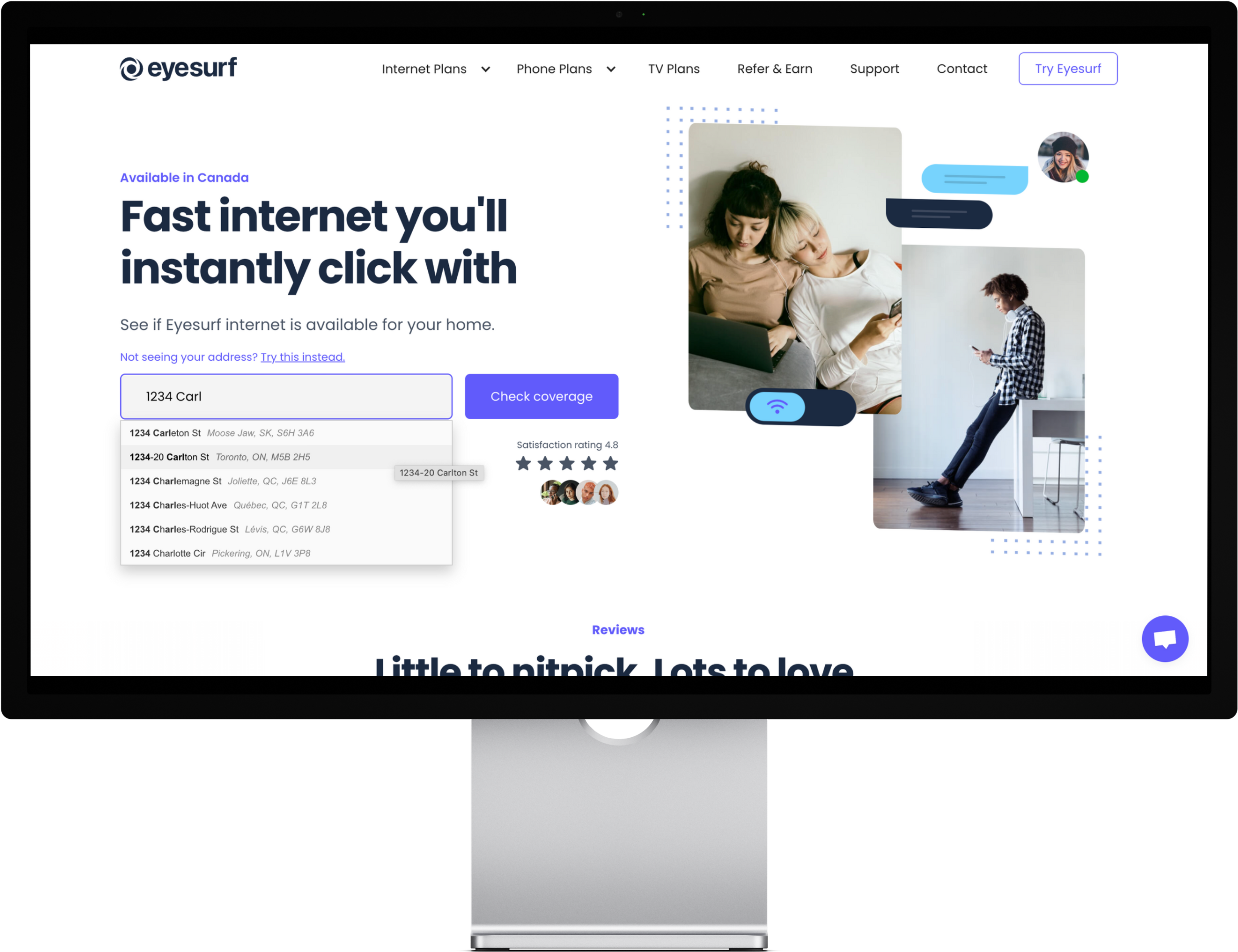
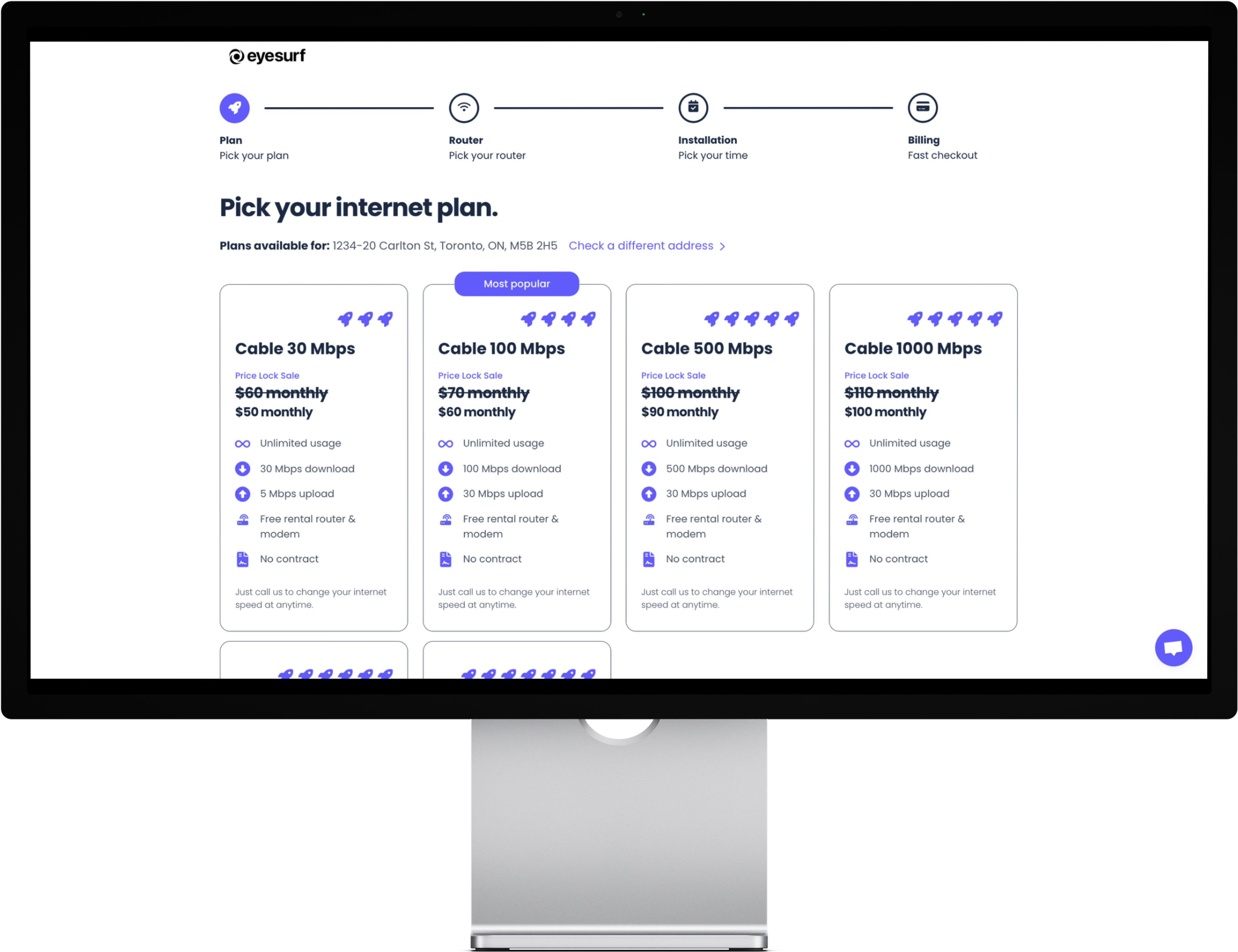
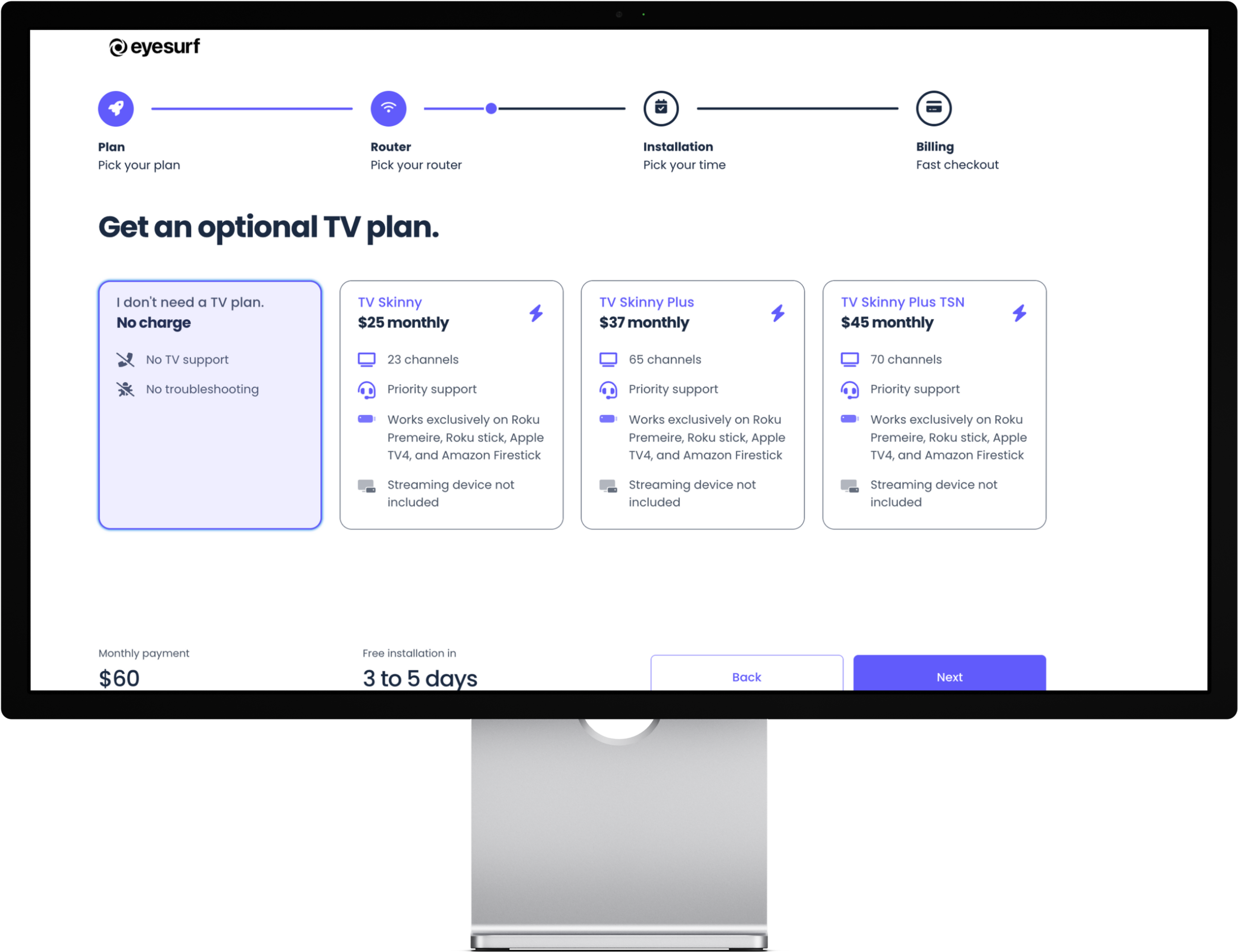
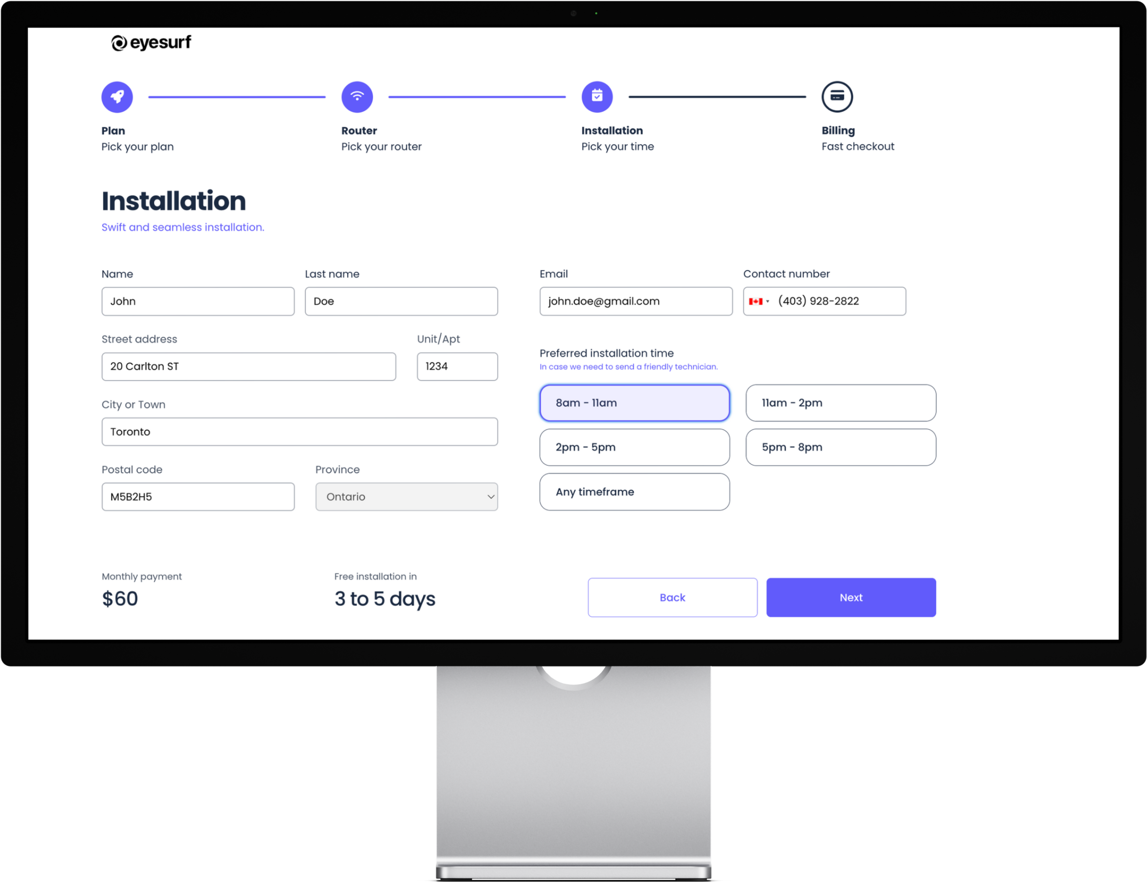
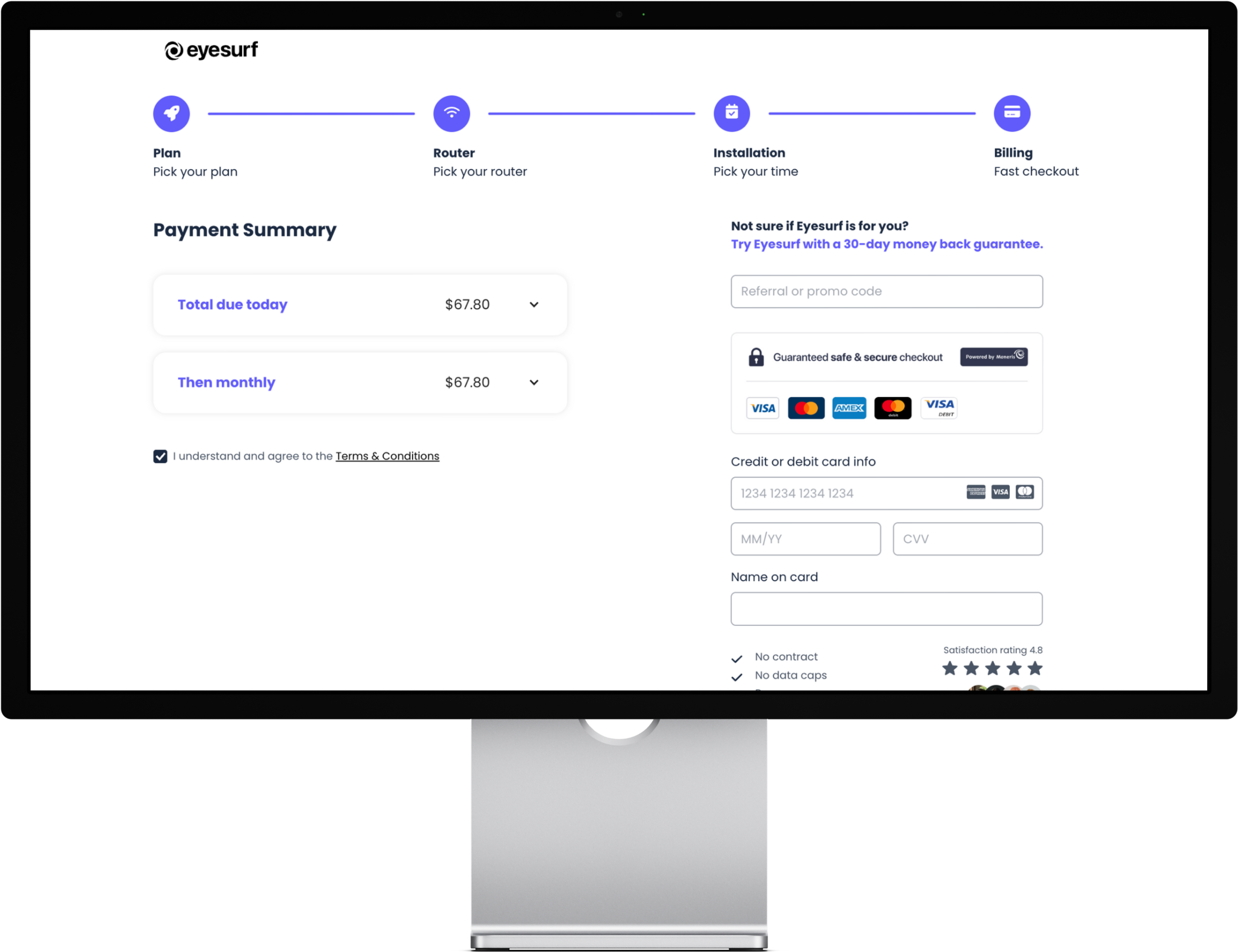
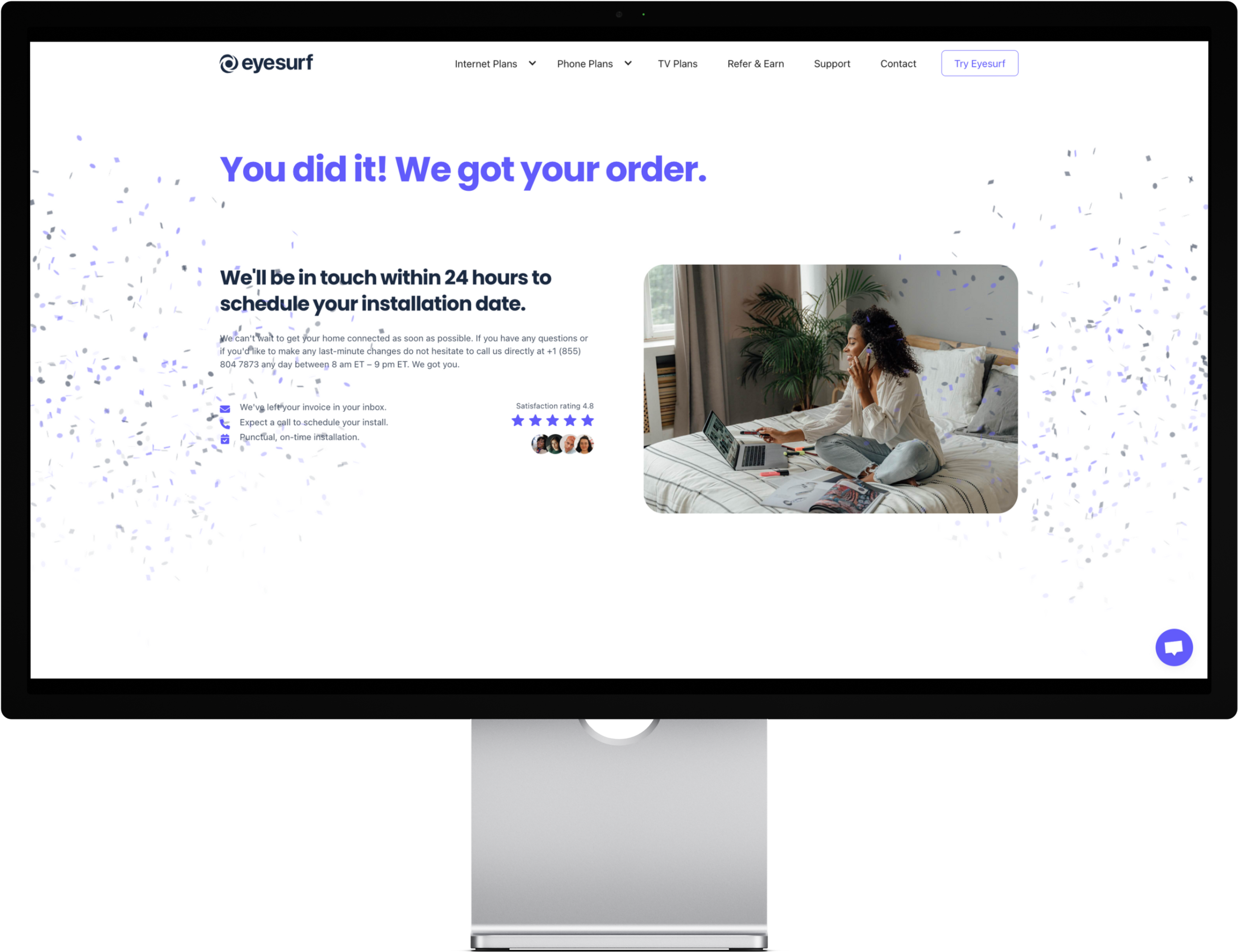
Eyesurf’s sign-up flow was slowing them down. Their funnel felt like a tax form — one long, overwhelming page asking for everything upfront. Customers were getting tired and dropping off. We reimagined the experience by splitting the journey into simple, fast steps: personal details first, then choosing a plan, then add-ons, and finally payment. Each step felt like progress, not work. More signups, fewer abandoned carts, and a buying experience as smooth as the internet service they deliver. Shortly after the changes, Eyesurf was acquired by a larger ISP — a testament to the growth a better customer journey can unlock.